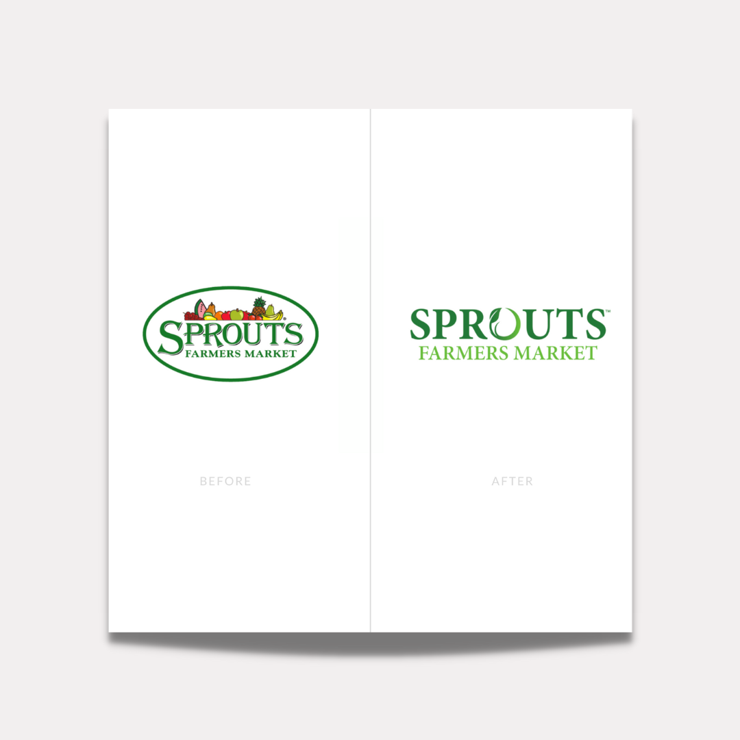
Corporate branding sometimes is a swing and a miss. My beloved favorite grocery store, Sprouts, has rebranded. Check out the before and after logos.
I think it’s a great direction towards modernizing the logo, but did we really want the beloved home grown Sprouts brand to feel modern and new? No, we did not. We love the signs throughout the store with pictures of the farmer’s and their location boasting #EatLocal.
That swirly green gradient leaf feels super dated. It’s giving free vector clip art site circa 2005 vibes. 🌱
The original logo didn’t bother me as much as this one does. If they removed the fruit clip art it would have been a big improvement yet staying classic to their homegrown brand identity. Now they have this new logo that doesn’t match the aesthetic or typography of the current website.
I don’t hate it, but it’s just okay. 4/10 for the Sprouts rebrand logo.
What do you think? Release your inner creative critic. Let’s discuss ↓



+ show Comments
- Hide Comments
add a comment